Longer term weather data for Carwoola
I will start by thanking Lynton Bond for providing key weather data for the Carwoola area through the Stoney Creek Gazette for approximately 2 gazillion years. However, like all good things his service in this regard has wound up and I am taking over the duty as well as I can.
I'll follow with a small anecdote:
Before getting on to comparisons, I'll mutter a little about 'quality'. I spent most of my last 15 years in paid employment working on this, and the key point was matching accuracy with what was needed. In other words is the data good enough for its planned use? A key issue here is to recognise that the data can be unnecessarily accurate: if all that is needed is an approximation it is a waste of time, money and blood pressure trying to get matters correct down to the nth decimal place.
My aim is to get stuff that is broadly consistent in its own series, so that one can say whether it was relatively wet/dry, hot/cold, windy/calm etc in a somewhat more normative way than how I (or you) have 'felt'. Trying to get fancier than that is a bit beyond me. I am not planning to get data accurate enough to assist in launching spaceships, planning expensive holidays or determining when crops should be planted!
The reports published in the Gazette essentially cover three topics:
As general points:
 The two series track quite well but the Whiskers series are somewhat below the Radcliffe series, especially in Summer.
To investigate this a little I examined a day x day comparison for the month of December 2013, which shows one of the more extreme differences. To provide a further bit of information I included the Bureau of Meteorology on-line climate data for that month at Canberra Airport (approximately 13km NW of Radcliffe). The results are summarised in the following chart.
 There is closer agreement between the BoM and Whiskers series than with the Radcliffe series. The series overly each other on several occasions and where they differ the BoM series is higher. (I would usually expect Whiskers to be lower than the Airport as the former is approximately 200m higher). I thus concluded that there is some attribute of the Radcliffe site (differing aspects of the sites, different shading by trees, etc) which leads to those readings being higher in Summer. Lynton has since advised that "the sun
 hitting the instrument’s detector in summer a lot more during early- to mid-afternoon than previously since the deciduous tree to the north-west of the station had been ravaged by a disease and is nearly bare."


Here is the chart comparing the two sets of data.
 There are a couple of spikes where Radcliffe got a bigger serve than us but essentially the correspondence between the data sets is astonishing. The correlation coefficient is still very sound at 96.8% and because the difference is not so much a consistently higher value for one series, the average difference per month comes out to 0.2mm. Again these two series are to all practical purposes identical.
 The correlation coefficient in still excellent at 96.2% and the average difference per month is 0.5mm (a little greater than the volume of a gnat's bladder, but a heavy dew amounts to a reading of 0.2mm on the Davis - which is probably not noticed on a Nylex). I find this level of agreement between series collected with different methods and sites a few kilometres apart quite astonishing.
Were it not for the differences in Maximum Temperature going forward would be simple. However, those differences exist and there are several possible ways to proceed:
Option 1 doesn't appeal as it discards the 3 years of data for Whiskers and option 4 similarly wastes the 20 years of valuable Radcliffe data (which while slightly different to Whiskers gives a backdrop of seasonal patterns which has been very useful for many years). Option 2 has some appeal but contravenes the Keep It Simple Stupid (KISS) principle.
Thus I have decided that where I have data for the Whiskers site I will replace the equivalent Radcliffe data. The effects of this are not great, even for maximum temperature, as I will have 20 years of Radcliffe data and ~3 years of Whiskers data. However over time the results will tend to balance out between the 2 sites which I feel is desirable.
I will add a small amount of text to the entry in the Gazette alerting readers to the changes: I don't want people seeing an increased occurrence of below average maxima and abusing it as though it plays down the importance of climate change when it is simply a resulted of altered methodology!
Here is a sample Gazette entry (click image to read).
 The red numbers are notes:
I'll follow with a small anecdote:
I recall being as a US Stats Bureau meeting where someone said that changing the batch (same brand, same colour) of paint on a temperature screen can cause a significant difference in the temperatures recorded. He was asking how they intended to calibrate terrestrial and satellite measures. The guy sitting next to me scribbed this down rather heavily: it was Al Gore - my closest brush with a famous person.The take-home message from this is any changes to methods in collecting weather data need to be looked at a bit to see how the 'after' is likely to compare with the 'before'. That is the main thrust of this post. As a reader advisory, I will draw to your attention that there are likely to be a few graphs further on in this so Arithmophobes may wish to be cautious in delving further.
Before getting on to comparisons, I'll mutter a little about 'quality'. I spent most of my last 15 years in paid employment working on this, and the key point was matching accuracy with what was needed. In other words is the data good enough for its planned use? A key issue here is to recognise that the data can be unnecessarily accurate: if all that is needed is an approximation it is a waste of time, money and blood pressure trying to get matters correct down to the nth decimal place.
My aim is to get stuff that is broadly consistent in its own series, so that one can say whether it was relatively wet/dry, hot/cold, windy/calm etc in a somewhat more normative way than how I (or you) have 'felt'. Trying to get fancier than that is a bit beyond me. I am not planning to get data accurate enough to assist in launching spaceships, planning expensive holidays or determining when crops should be planted!
The reports published in the Gazette essentially cover three topics:
- Maximum temperature
- Minimum temperature; and
- Rainfall
As general points:
- Lynton has provided me with his historic data for the Bonderosa in Radcliffe, and I have based my analysis on the monthly averages from January 1993 to April 2016 for temperatures and from May 1984 to April 2016 for rainfall (for which the earlier material includes data collected at another site about 1km away).
- I have temperature data for our place on Whiskers Creek Rd for 37 months between January 2013 and April 2016 (a few months are missing due to equipment 'issues') For rainfall I have data from February 2007 to April 2016. The first several years of rainfall are from a Nylex plastic collector but the last 3 years are based on a Davis Weather Station.
The big picture
My overall conclusion is that by and large the two sets of data are quite similar enough to allow them to be combined for use as a broad indicator of recent weather patterns. Some details about how I will proceed follow the comparisons, but I can quite happily continue the work of providing material for the Gazette and will also continue my monthly blog posts with additional material from my weather station and the customary rants and witticisms.
Maximum Temperatures.
I have, as commented above, 37 months of data about temperatures. I compared them with data for Radcliffe used in the Gazette. A first measure was to check the correlation coefficient (ie do they move in similar ways?) This came in at 98.5% for this measure which I rate as quite satisfactory. I also looked at the differences between the readings: my weather station is on average 2oC lower than the readings for Radcliffe. A graph illustrates these points.
To investigate this a little I examined a day x day comparison for the month of December 2013, which shows one of the more extreme differences. To provide a further bit of information I included the Bureau of Meteorology on-line climate data for that month at Canberra Airport (approximately 13km NW of Radcliffe). The results are summarised in the following chart.

Minimum temperatures
The situation is largely similar to that of maximums discussed above, with an even higher correlation coefficient of 99.3%. The difference between readings is both less (at an average of 1.01oC ) and much more stable.

For the practical purposes of this exercise the series are identical. Lynton has also commented on this correspondence noting that "anecdotally, our dam is around 4 degrees colder overnight than around the house, where the measurements are taken. The dam has had several frosts this year, whereas today was the first frost at the house." Taking a frost to mean the appearance of hoar frost on the ground as an indication of an air frost (as is a weather station reading of 0 degrees) a couple of comments are relevant:
- at Whiskers there is sometimes a hoar frost around the Creek - about 15m lower than the weather station - when the weather station reports a temperature above 0 (ie exactly the Radcliffe situation); and
- we have had 2-3 frosts at the weather station this year (supporting the finding that we are a very small amount cooler than Radcliffe).
Rainfall
The major operational difference for this variable is that I have a full set of data since January 2007 when we moved here. The data was gathered by manual inspection of a Nylex cylinder until late 2012 and for most months since then data has been provided by a Davis Weather station. Following on from the anecdote above it seems sensible to address these two periods separately.
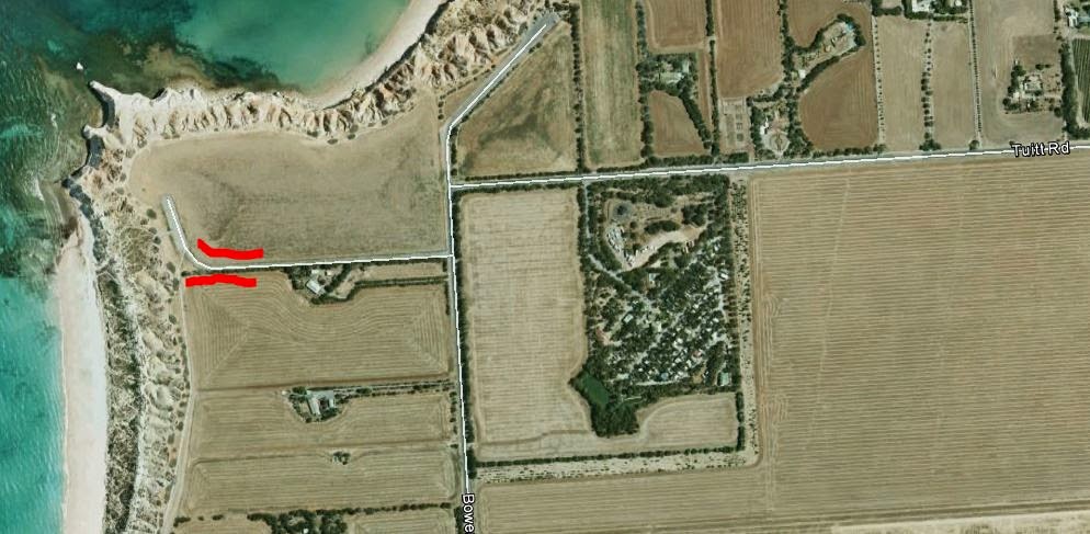
Before doing so it should be noted that rainfall can be very patchy across the area as typified by the events of March 3 2016. The variation in rainfall on that date is illustrated by this map:
Our house is the one tagged 21, just above the 50. Radcliffe is close to the tag of 27.
The Nylex era.
For the purposes of this exercise this covers the period January 2007 to December 2010 and refers to the time when I believe both sites were collecting data through Nylex gauges. (In fact this continued until January 2013 but I initially had trouble persuading Microsoft software on my Canberrato handle the Radcliffe data for 2011-12 and as will be shown below it didn't seem necessary to repeat the exercise once that problem had been solved.)Here is the chart comparing the two sets of data.

The Davis era
For most of the time since January 2013 a Davis Weather Station has been used at Whiskers to collect rainfall (and hail and snowfall when they are available for collection) while (I believe) a Nylex has continued in use at Radcliffe. Whatever: the chart covering this period again shows two series pretty much in lockstep.
Going Forward
As I said above I am quite happy to continue on compiling data for the Stoney Creek Gazette and compiling my blog posts.Were it not for the differences in Maximum Temperature going forward would be simple. However, those differences exist and there are several possible ways to proceed:
- Ignore differences and simply extend the Radcliffe series by adding the future Whiskers data to them;
- Where differences exist use the average of the two readings;
- Use the Radcliffe data where there is no Whiskers data, but use Whiskers data where that is available;
- Discard the Radcliffe data.
Option 1 doesn't appeal as it discards the 3 years of data for Whiskers and option 4 similarly wastes the 20 years of valuable Radcliffe data (which while slightly different to Whiskers gives a backdrop of seasonal patterns which has been very useful for many years). Option 2 has some appeal but contravenes the Keep It Simple Stupid (KISS) principle.
Thus I have decided that where I have data for the Whiskers site I will replace the equivalent Radcliffe data. The effects of this are not great, even for maximum temperature, as I will have 20 years of Radcliffe data and ~3 years of Whiskers data. However over time the results will tend to balance out between the 2 sites which I feel is desirable.
I will add a small amount of text to the entry in the Gazette alerting readers to the changes: I don't want people seeing an increased occurrence of below average maxima and abusing it as though it plays down the importance of climate change when it is simply a resulted of altered methodology!
Here is a sample Gazette entry (click image to read).

- In a few cases the temperatures were recorded on more than one day. Where that has happened I have given the later date.
- This is based on expanding the value for the year to the end of themonth by the average proportion of the annual total achieved by that date.

Comments